January 15, 2025
Written by: Cyd Stumpel
CSS Scroll-driven animations for Creative Developers
Scroll animations have been around for years and are pretty much synonymous with Creative Development, but they have always required JavaScript to record the scroll position. This brings up a myriad of issues when done incorrectly, like; lagging animations, heavy recalculations on resize, heavy feeling websites overall, unresponsive websites in slow internet environments and much more.
But even if you “do it well”, JavaScript still runs on the main thread, the scary place where browsers process user events, CSS repaints and reflows. We want to spend as little time there as possible because when the main thread is blocked by JS for example, it will delay or block other user interactions and make websites unresponsive. Moving scroll animations from the main thread to it’s own thread with the Scroll-driven Animations module in CSS makes it faster and more performant.
CSS scroll-driven animations are only supported in Chromium browsers at the moment, which is probably why many creative developers haven’t really looked into it yet. But, after using it on my portfolio (with GSAP Scroll Trigger backups), I’m sold.
The basics
Scroll-driven animations rely on CSS keyframe animations, but in stead of time determining the progress of the animation it’s the scroll position of the user.
At this moment there are two types of scroll based animations; view- and scroll progress. In short: scroll progress timelines have start and end values that are based on the start and end position of the scrollable container (the body by default). View progress timelines are determined by the (linked) element’s position in the viewport. For my fellow GSAP enthousiasts; it’s similar to setting a trigger; that trigger can be the element you’re animating but also some other element on the page.
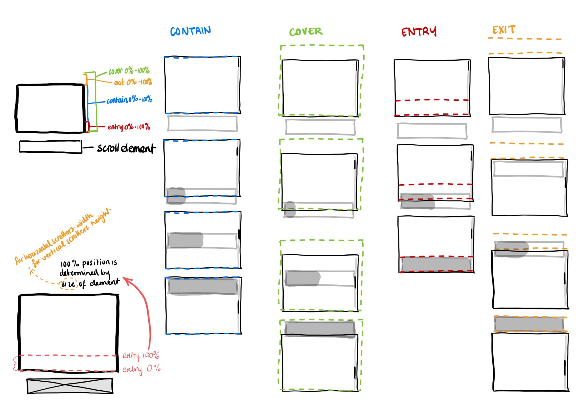
Both timelines have an animation-range property, which you can use to alter the start and end positions, although the current documentation only mentions view timelines in the examples and the effects are pretty different on both elements when using the same values.
If you’re familiar with GSAP’s ScrollTrigger, the animation ranges will probably take some getting used too. Bramus van Damme created this nice visualizer to play with.
But I still had to draw it out, to have it make sense to me, maybe it helps you too:
Here’s an example of a progress bar that’s triggered by the scroll() progress, and animates the scaleX value (animating scale causes no CSS repaints) from 0 to 1:
.progress-bar {
	position: fixed;
	top: 0;
	left: 0;
	width: 100%;
	height: 5px;
	background: #ececec;
	.progress-bar__inner {
		width: 100%;
		height: 100%;
		background: hotpink;

		animation-timeline: scroll();
		animation-name: progress-bar;

		transform: scaleX(0);
		transform-origin: left center;
	}
}

@keyframes progress-bar {
  from {
		transform: scaleX(0);
  }
  to {
		transform: scaleX(1);
  }
}Progress bars were popular on articles a few years back, the ‘problem’ (in my neurotic opinion) for this specific use case is that scroll() looks at the scrollable container for its start and end values, and will count elements like header, footer, related articles, etc as progress too.
In the example below I’m using the .content element (this element would only have the content of the article inside it) as the view timeline element, this element together with the animation-range property will now determine the start and end of the animation.
/* you have to define the view timelines in a parent component if you're not animating a direct child of the view timeline (https://developer.mozilla.org/en-US/docs/Web/CSS/timeline-scope) */
body {
  timeline-scope: --content;
}

.content {
  view-timeline: --content;
}

.progress-bar {
	position: fixed;
	top: 0;
	left: 0;
	width: 100%;
	height: 5px;
	background: #ececec;
	.progress-bar__inner {
		width: 100%;
		height: 100%;
		background: hotpink;

		animation-timeline: --content;
		animation-range: entry 100svh exit;

		animation-name: progress-bar;
		animation-fill-mode: forwards; /* So scaleX will remain 1 after the timeline is done */
		transform: scaleX(0);
		transform-origin: left center;
	}
}

@keyframes progress-bar {
  from {
		transform: scaleX(0);
  }
  to {
		transform: scaleX(1);
  }
}Here’s a codepen where you can see the difference (toggle the checkbox):
See the Pen Progress bar two ways by Cyd Stumpel (@Sidstumple) on CodePen.
The entry 100lvh start value only starts the animation when an element hits the top of the screen, very useful for sticky elements too!
Applied scroll animations
I’ve noticed that a lot of the examples created with Scroll-driven animations are not really things creative developers would use. I created a collection with use cases for creative Developers.
Marquees:
See the Pen Scroll-driven marquees (CSS only) by Cyd Stumpel (@Sidstumple) on CodePen.
Parallax animations
See the Pen Parallax scroll-driven animations – CSS only by Cyd Stumpel (@Sidstumple) on CodePen.
Appear animations
See the Pen Appear scroll-driven animations – CSS only by Cyd Stumpel (@Sidstumple) on CodePen.
JavaScript API
You can’t say Creative Development without saying Javascript, so thankfully, there’s ScrollTimeline for JavaScript, which hooks into the Web Animations API. I haven’t worked at all yet with WAAPI, but I hope to check this out soon.
A11y
Don’t forget to remove the animations for people who have the prefers-reduced-motion setting activated. Don’t know how? Check out the Codepens above for more information
Graceful degradation
In the beginning of this article I mentioned that the scroll-driven animation module only works on chrome, we can implement the graceful degradation software philosophy here, backing the CSS animations up with JavaScript:
// checks if this CSS property + value is supported:
if (!CSS.supports('animation-timeline', 'view(y 100lvh 50px)')) {
  // backup code here
}For example, this is how I backed up the title animations on this portfolio:
import gsap from 'gsap'
import { ScrollTrigger } from 'gsap/ScrollTrigger'
gsap.registerPlugin(ScrollTrigger)

if (!CSS.supports('animation-timeline', 'view(y 100lvh 50px)')) {
		const scrollHeadings = [...document.querySelectorAll('.js-scroll-heading')]
		scrollHeadings.forEach(el => {
			gsap.to(el, {
  			scrollTrigger: {
  				trigger: el,
  				endTrigger: window.innerWidth > 1024 ? el : el.closest('section'),
  				start: 'top top+=24',
  				end: window.innerWidth > 1024 ? 'center top' : 'bottom top',
  				toggleActions: 'play none play reverse',
  				scrub: window.innerWidth > 1024 ? true : false, // remove scrub on mobile, because it's janky
  			},
  			duration: 0.3,
  			scale: window.innerWidth > 1024 ? 0.3 : 0.5,
  			ease: 'none'
			})
		})
}It’s good to wrap the CSS side in @supports tags too, to make sure the animation is only applied when animation-timeline is supported:
.scroll-heading {
  position: sticky;
  top: 0;
  z-index: 10;

  --scale: 0.3;

  // sidenote: this is my sass variable for tablet screens prints something like screen and (max-width: 1024px)
  @media #{$medium-down} {
    --scale: 0.5;
  }

  span {
    display: block;
    transform-origin: top center;
    @media (prefers-reduced-motion: reduce) {
      // if user prefers reduced motion: the title is small without the animation:
      transform: scale(var(--scale));
    }
    @media (prefers-reduced-motion: no-preference) { // only implement if prefers reduced is not set;
      @supports (view-timeline: --entry-0) { // only implement if view-timeline property is supported
        animation-timeline: view(y);
        animation-range: entry calc(100lvh - var(--padding)) entry 110lvh;
        animation-timing-function: var(--default-ease);
        animation-name: scale-out;
        animation-fill-mode: forwards;
      }
    }
  }
}

@keyframes scale-out {
  to {
    transform: scale(var(--scale));
  }
}
Resources and tools
Did I miss something?
Do you see any mistakes or did I miss something important? Please let me know by sending an email!
