January 27, 2025
Written by: Cyd Stumpel
A Practical Guide to the CSS View Transition API
View transitions are, at the time I’m writing this article, supported in all major browsers, except for Firefox. Until a short time ago you could only use view transitions in a Single Page App (SPA) and not with ‘Multi Page Apps’ that use cross-document navigation, or how we used to call it: just normal websites that use different HTML files and native routing.
View transitions are really exciting and work really well for the most part; there are some limitations and constraints you should be aware of when you plan to use it, but it’s still a relatively easy enhancement for projects.
The basics
View transitions make a snapshot of the current state and the next state, when it is called. By default it will add a crossfade animation between the two states. View transitions are not limited to page transitions, they can be implemented on almost any element that changes to a different state.
The CSS you need for ‘cross document navigation‘:
@view-transition {
  navigation: auto;
}Yes, it’s that easy to add the default cross fade to your website.
Understanding snapshots and debugging animations
When the view transition is called, either by navigating to another page, or manually (calling it with JavaScript), it will make snapshots of all view transition elements; by default this is just the root element, but, by using the view-transition-name CSS property, you can create more snapshots. You might be wondering, snapshot? But that’s what it is; it turns your page/named elements into an image. That means that some CSS properties are no longer going to have effect. For example; consider this code:
h1 {
  view-transition-name: heading;
}If you want to change the font-size during the animation, you won’t be able to, the h1 is no longer a text element during animation, it’s a flat image and font-size doesn’t affect images. You can however change the font size of the new state; but because the snapshots are images during the animation, you need to make sure to have the same ratio and line breaks as the old state (more on this later).
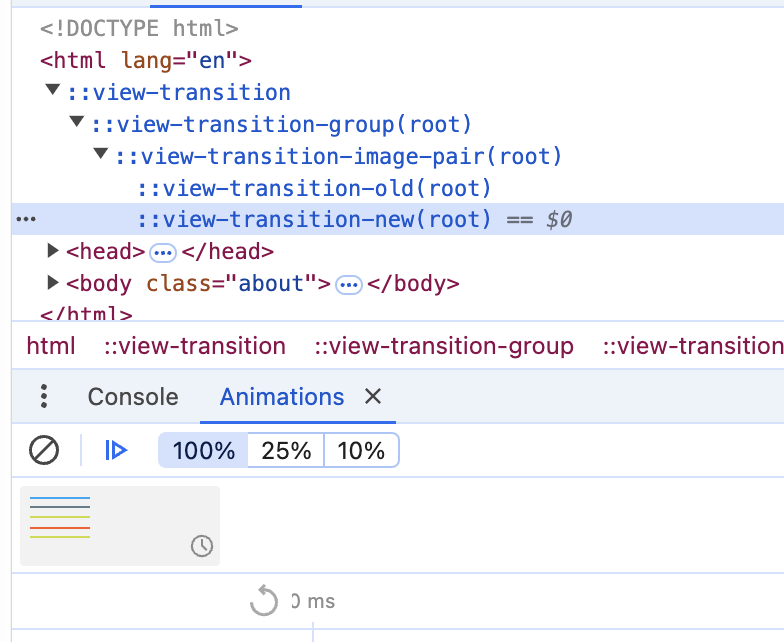
A good way to understand view transitions better is using the Animations panel in the Chrome Dev Tools.
You can slow down, pause and replay view transitions using this panel. You can try this out on this super simple example of view transitions.
When you pause the animation you will see the ::view-transition pseudo elements. If you add more view-transition-names you will see more ::view-transition-groups here, root will be replaced by the name of the view transition.
You can add a custom animation to the ::view-transition-old and -new pseudo elements, this is the default example from the docs (available in the example by checking the cooler animation checkbox).
  /* Apply the custom animation to the old and new page states */
::view-transition-old(root) {
  animation: 0.4s ease-in both move-out;
}

::view-transition-new(root) {
  animation: 0.4s ease-in both move-in;
}

/* Create a custom animation */
@keyframes move-out {
  from {
    transform: translateY(0%);
  }

  to {
    transform: translateY(-100%);
  }
}

@keyframes move-in {
  from {
    transform: translateY(100%);
  }

  to {
    transform: translateY(0%);
  }
}If you want to animate elements between pages you have to make sure that:
- Elements are the same ratio on both pages, they can differ in size but to animate seamlessly it needs to be the exact same ratio.
- Elements have the same unique view transition name, this is hopefully going to change in the future, but for now there can only be one element with a certain
view-transition-nameper page. - Remember that you’re animating snapshot images of the actual elements on your page, not HTML elements.
If you make sure of all these steps you don’t even need to add a custom animation, CSS figures out the new positions and will take care of the animation. In this codepen I’ve called document.startViewTransition manually with a small expanding animation:
See the Pen View transitions – CSS only by Cyd Stumpel (@Sidstumple) on CodePen.
Limitations
There are some limitations to view transitions; since we’re animating images some are a bit obvious but some are less so; here are a few that I ran into:
- Elements need to be the exact same ratio. I mentioned this before, but this causes some big issues for text. What you might have not considered is: some text will run over more lines when animated than the initial state and some have an inline display at the start (intrinsically sized) and block display at the end (100% width); the ratio of the element for view transitions is determined by the bounding box of the text element. Jake Archibald lines up some things you can do to fix aspect ratio issues in text in this article.
- There’s no such thing as
clip-pathin a::view-transitionpseudo class; if you’re animating an element that was clipped through overflow or clip path by another element it will appear unclipped in the pseudo class. You can probably fix this by making the parent element the clipped element, but in some cases you want to change the aspect ratio of an element when animating between states, I recommend doing this either when the new state is done as a separate animation or before the old state starts animating. - Animating stuff with border radii and backgrounds get distorted when they’re not the exact same ratio, see video. It looks *fine* when the animation is quick, but when it’s slowed down with the Dev Tools Animation panel later in the video it looks a bit weird:
