A deep dive into how I set up view transitions
If you’ve seen any version of my You might not need JS (also known as CSS came for my Job and Modern CSS for creative developers) talk, you know that I create a conference website to demo all the cool things CSS can take over from JavaScript now.
For my talk at JS heroes, earlier this year, I did the same thing, but ran out of time before I could get to the view transitions I created. But now that summer has started and I’ve been twiddling my thumbs for a couple of days, having barely anything to do, trying to relax and failing, I thought: why not write out the process of how I built this?
If you don’t want to read the whole design- and concept process, no hard feelings; click here to go straight to the code💪.
Design and conceptualising
I’m not a designer, or more accurately, I do not like to design for paying clients. Mostly because I don’t like subjective feedback on my work 😅, and when you’re a designer you have to deal with that a lot. Whereas when you only build the website, feedback will be more about objective functionality requests.
This Figma screenshot below might also show you why I would be a developer’s worst nightmare. Because while I love structure in code, I can’t bring myself to clean up Figma designs, I almost never name my layers or artboards, I like having references right next to screens, I like not building the entire thing out in Figma and finishing it in code. I basically use Figma as a high fidelity sketching tool.
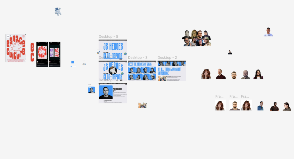
Something that usually bothers me about conference websites is how different all the speaker’s photo style is, in color mode, background, hues, how much of the speaker is visible etc. It makes it really difficult to create a cohesive-feeling speaker overview. Some conferences do this really well, like FFConf and CSS Day for example.
For this demo I chose to remove the backgrounds, which is really easy now at the push of a button with Figma. I also used Figma’s expand image functionality to give some speakers that were cut off some shoulders or add back the top of their head. I’m really apprehensive about using any AI to edit anyone’s picture, I’ve been edited for some conferences in the past without my permission, and I hate it. But this was pretty minimal and didn’t change anything of the speakers faces.
Another thing that’s really inconsistent between speakers is the title length of their talks, JS Heroes already added a topic to their own overview, so I could just use that for the overview instead.
Now that the speakers didn’t have a background I could animate them over their talk’s topic, a fun composition, that really came to haunt me when I created the view transitions, but more on that later…

I knew some topics where longer than others, so not all speakers would intersect with their topic, but that was fine in my view.
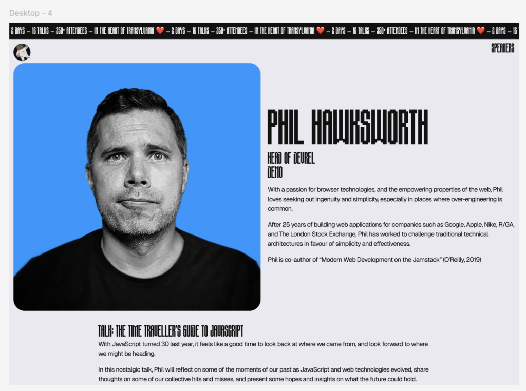
When you want to create smooth view transitions it’s pretty essential that you have some consistent elements between states. It’s also much easier to animate elements that remain the same aspect ratio between states, so I made sure the speakers would have the same ratio image on the detail page.
Setting up my view transitions
@view-transition {
  navigation: auto;
}


:root {
  --ease: cubic-bezier(0.34, 1.06, 0.64, 1.1);
  --ease-in: cubic-bezier(0.36, 0, 0.66, -0.36);
  --duration: 0.4s;
}


@media (prefers-reduced-motion: no-preference) {
  [style*='--vt'] {
    view-transition-name: var(--vt);
  }
}To add view transitions between pages (cross document view transitions), which is supported in all major browsers except for Firefox, you need to add the view-transition at-rule to your CSS. Place the CSS for your cross document view transitions as high as possible in your <head>, if you add it later it can occur that your CSS will take too long to load and not be implemented at all.
I also add some defaults as CSS variables, my default ease is a slightly bouncy ease-out bezier curve, I also added a slightly bouncy ease-in bezier curve I could use and a default duration of 0.4s, which I can use to make sure my animations line up.
Now we need to decide which elements to add a view transition name to, this will add them to the view transition pseudo tree and will allow us to animate them in/out separately.
I decided to add the image, topic, speaker name and the gradient behind the speaker name to the pseudo tree by giving these elements a unique view-transition-name. Here’s a visualisation of the different layers:
This allowed me to animate the topic up, the name down, the gradient out and the image to the new position.
::view-transition-group(*),
::view-transition-old(*),
::view-transition-new(*) {
  animation-fill-mode: both;
  animation-duration: var(--duration);
  animation-timing-function: var(--ease);
  animation-delay: calc(var(--duration) * var(--order));
}I then added some defaults to all the view transition groups, olds and news by using the * selector.
Using CSS variables really helped me to finetune the timings. I added an animation-delay that multiplies the --duration with a CSS variable named --order , if order is not defined this line will just be ignored, which is exactly my intention.
::view-transition-old(root) {
  --order: 0;
}

::view-transition-new(root) {
  --order: 3;
}For example, I want the view-transition-old of the root (HTML) element to animate out first, and the new one last, so I gave them different order variables.
::view-transition-old(.speaker-image):only-child {
  --order: 1;
  animation-name: scale-down;
  animation-timing-function: var(--ease-in);
}

::view-transition-new(.speaker-image):only-child {
  --order: 4;
  animation-name: scale-up;
}When the speaker image’s view-transition-old is an only child, it means that it’s not the clicked speaker, because the clicked speaker will both have a -new and -old view transition, I wrote an article explaining how that works. The speakers that are not clicked get an --order of 1, meaning they will animate out after the old root transition has animated out.
The speaker image’s view-transition-new comes in when you go from the detail page back to the overview, when the view-transition-new of the speaker image is an only child it means it was not the speaker on the detail page that was just active. I want those to animate in last so I gave them an --order of 4.
::view-transition-group(.speaker-image) {
  --order: 2;
  overflow: clip;
  border-radius: var(--padding-inline);
}The view transition group is responsible for the transforms of a view transition element, for the speaker image I gave it an --order of 2, so it will only start moving after the not-clicked speakers have animated out.
Then I had issues…
I wanted to give the speakers a cool duotone effect, and wanted to do it with code, that however meant that my images no longer had transparent backgrounds, their background was blue because of my filters. That resulted in either the topic flashing over the speaker’s image before animating out, or the topic disappearing behind the blue background of the speaker.
I considered mix blend modes to fix this, but it wasn’t what I wanted. Then I remembered this breakdown from Wes Bos from Syntax and found my answer: MASKS!!
To dynamically add the correct mask to each speaker I added some inline styles to the speaker detail html:
<!-- speaker detail page -->
<style>
  :root {
    --speaker-mask: url(../.././assets/img/masks/phil-mask.png);
  }
  ::view-transition-group(.speaker-topic) {
    mask-image: url(../.././assets/img/masks/phil-mask.png);
  }
</style>This way I could get the correct mask image without needing any JavaScript. I struggled a lot with creating a png version of this for a while which turned out to be completely unnecessary because then I found out about mask-mode: luminance, which allowed me to use any image with a big contrast between black and white. I made sure my speaker topic was the same size as the container, put the mask on it, and… magic!
::view-transition-group(.speaker-topic) {
  mask-size: 100%;
  mask-mode: luminance;
  mask-repeat: no-repeat;
  mask-position: bottom;
}I was able to create all of this without needing any JavaScript, I added a class to each speaker detail’s HTML tag called speaker-detail, and added a class to the overview’s HTML element called index. This allowed me to add specific view transitions depending on what page the user was navigating to and from.
html.speaker-detail {
  /* specific code for index to speaker detail*/
}

html.index {
  /* specific code for index to speaker detail*/
}I’m really happy with my --order logic as I’ve set it up in this project and will use it in production this way as well from now on.
Forcing myself to create a conference website for every conference I do this talk at might give me some stress, but it also helped me to understand view transitions better every time I do. So here’s your encouragement to make cool things with view transitions, just to experiment and have some fun!
You can find this project on GitHub, as well as my other conference websites.

Last updated: July 8, 2026
3 Webmentions
Join the conversation on Bluesky
Likes 3


Webmentions are a way to connect with other people who have shared your work.